I am a fan of Lea Verou's work and today she (@leaverou on twitter) , tweeted her dablet on making a hexagon shaped image in HTML/CSS , https://twitter.com/LeaVerou/status/298531187167752192
I got really fascinated by it, and here is a token of appreciation of lea's work. The code is really simple and fascinating.
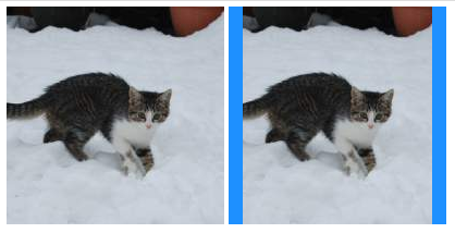
First we start with a normal image on the left and on the right we have an image inside a div(hexagon).
In the following few steps we will convert the image on the right to a perfect hexagon, the image on the left is for comparison purposes.
.hexagon {
 background:dodgerblue;
display: inline-block;
position: relative;
width: 200px;
height: 200px;
overflow: hidden;
}
.hexagon > img {
position: absolute;
clip: rect(0,187px,200px,13px);
}
(I have intentionally colourder the div for easy undersstanding)
Rotate the image
Rotate the div in the opposite direction
.hexagon{
transform:rotate(-45deg);
}
we are rotating it anticlockwise because we have already rotated the image by 45 degrees, if we rotate the div also by +45 degrees the kitty will appear to be inverted, and we don't want that.
Scale the div
.hexagon{
transform: scale(1.25,.707) rotate(-45deg);
}
Remove the background
I got really fascinated by it, and here is a token of appreciation of lea's work. The code is really simple and fascinating.
First we start with a normal image on the left and on the right we have an image inside a div(hexagon).
In the following few steps we will convert the image on the right to a perfect hexagon, the image on the left is for comparison purposes.
.hexagon {
 background:dodgerblue;
display: inline-block;
position: relative;
width: 200px;
height: 200px;
overflow: hidden;
}
.hexagon > img {
position: absolute;
clip: rect(0,187px,200px,13px);
}
(I have intentionally colourder the div for easy undersstanding)
Next up, we elongate the image, with
.hexagon > img{
transform: scale(x,y);
}
in this case choose x<1 and y>1, since we want to elongate it vertically.
Rotate the image
.hexagon > img{
transform: rotate(45deg) scale(.8, 1.404);
}
.hexagon{
transform:rotate(-45deg);
}
we are rotating it anticlockwise because we have already rotated the image by 45 degrees, if we rotate the div also by +45 degrees the kitty will appear to be inverted, and we don't want that.
Scale the div
.hexagon{
transform: scale(1.25,.707) rotate(-45deg);
}
Remove the background
View the complete code on dabblet here http://dabblet.com/gist/3392707


